
Murdering Friction: Inside InvenOps (BidPointX) iOS 1.0.5
Stop Fighting Your Software
In the realm of field operations, design is rarely discussed in terms of aesthetics. If a button is the wrong shade of blue, nobody cares. If a button requires three taps instead of one, everyone cares because that translates to wasted time. Design iteration is pure operational leverage. Version 1.0.5 of the InvenOps iOS app is built entirely around this concept. We did not bolt on new features just to make the changelog look busy. Our job is to ruthlessly eliminate the friction in the core actions field teams repeat dozens of times a day.
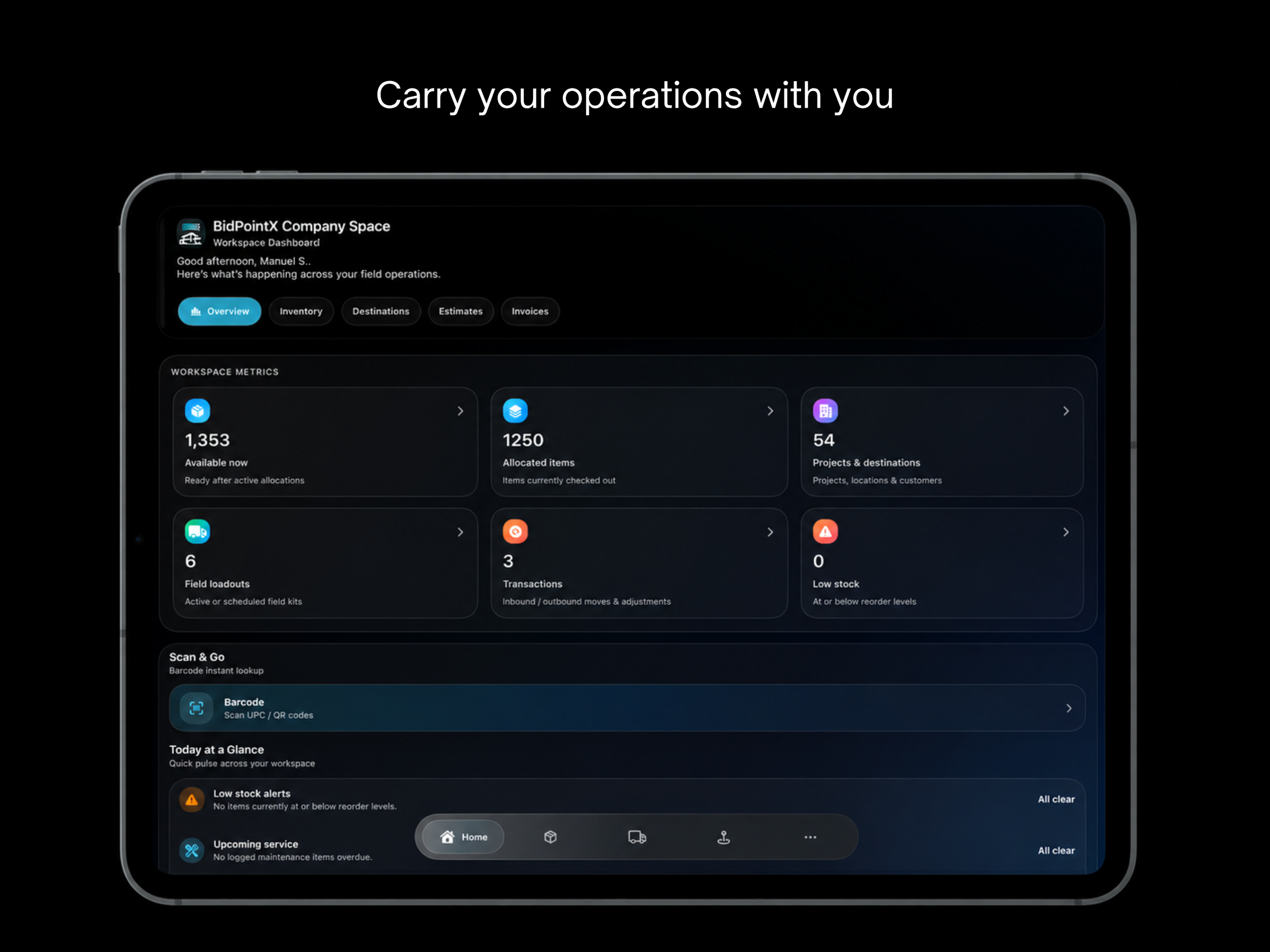
Good navigation should essentially disappear into the workflow. We redesigned the bottom navigation so Home, Items, Loadouts, Places, and Menu are immediately accessible from anywhere. The layout is structured around fast thumb movement, providing clearer context and minimizing interruptions between tasks. You should not need a map to use a mobile app. The goal is to make the existing workspace feel faster and drastically easier to navigate without breaking your stride.
Waiting is for Doctor's Offices
Speed is not just a backend engineering metric to brag about in a staff meeting. It is a fundamental component of the user experience. We implemented faster page loading and preloading across core areas to make the app feel instantaneous. When a team member is standing in a yard trying to check inventory or verify loadouts, waiting for a screen to render breaks their momentum. We decided to murder the loading spinner so your crew can actually get back to work.
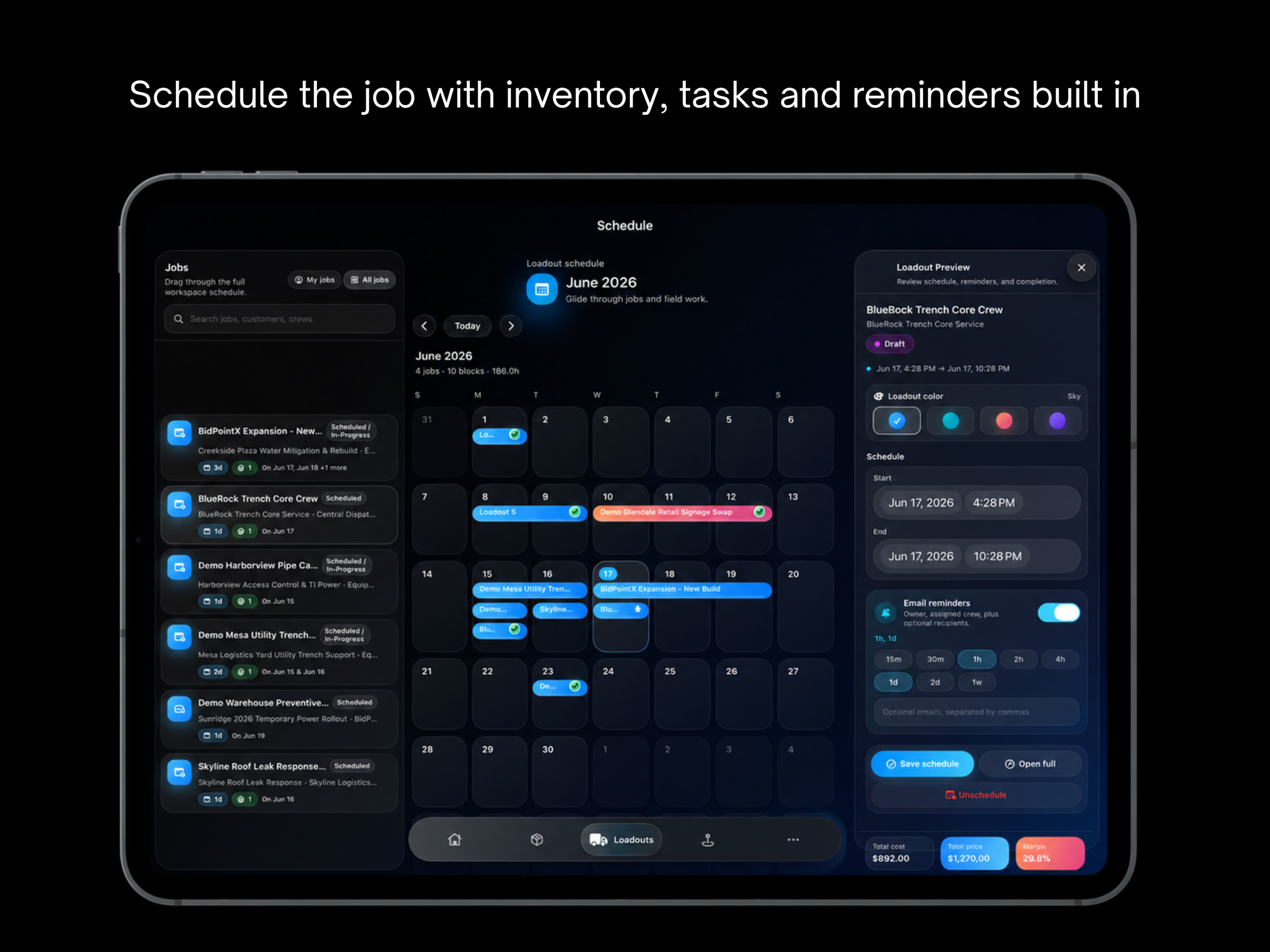
We also looked closely at how teams interact with time. Scheduling needs to feel tactile. It should not feel like filling out a sterile web form disconnected from the actual job. We upgraded the loadout calendar with richer schedule controls, visual previews, reminders, and clear visibility into completed work. It is now a direct, visual representation of the day rather than a glorified spreadsheet.
Assets & Inventory Don't Live in a Theoretical Void
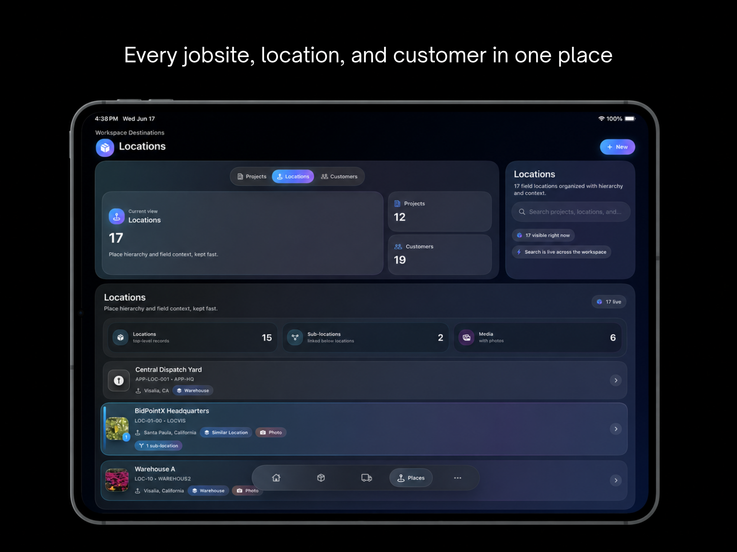
Space is equally important because operations are rarely flat. The Destinations experience now properly reflects the real hierarchy of a workspace, including nested sub-locations. Yards, warehouses, job sites, and specific storage areas all require exact context. The software now maps directly to how teams actually think about their physical locations instead of forcing reality to fit into a generic dropdown menu.
When you navigate to an item in those locations, the details must inspire instant confidence. Inventory detail screens have been overhauled so allocation, reservation, and location context are impossible to miss. Users know exactly where an item is, what is reserved, and what actions are available to them. You no longer have to interrogate the software to find basic facts about your own equipment.
Stop Treating Invoices Like State Secrets
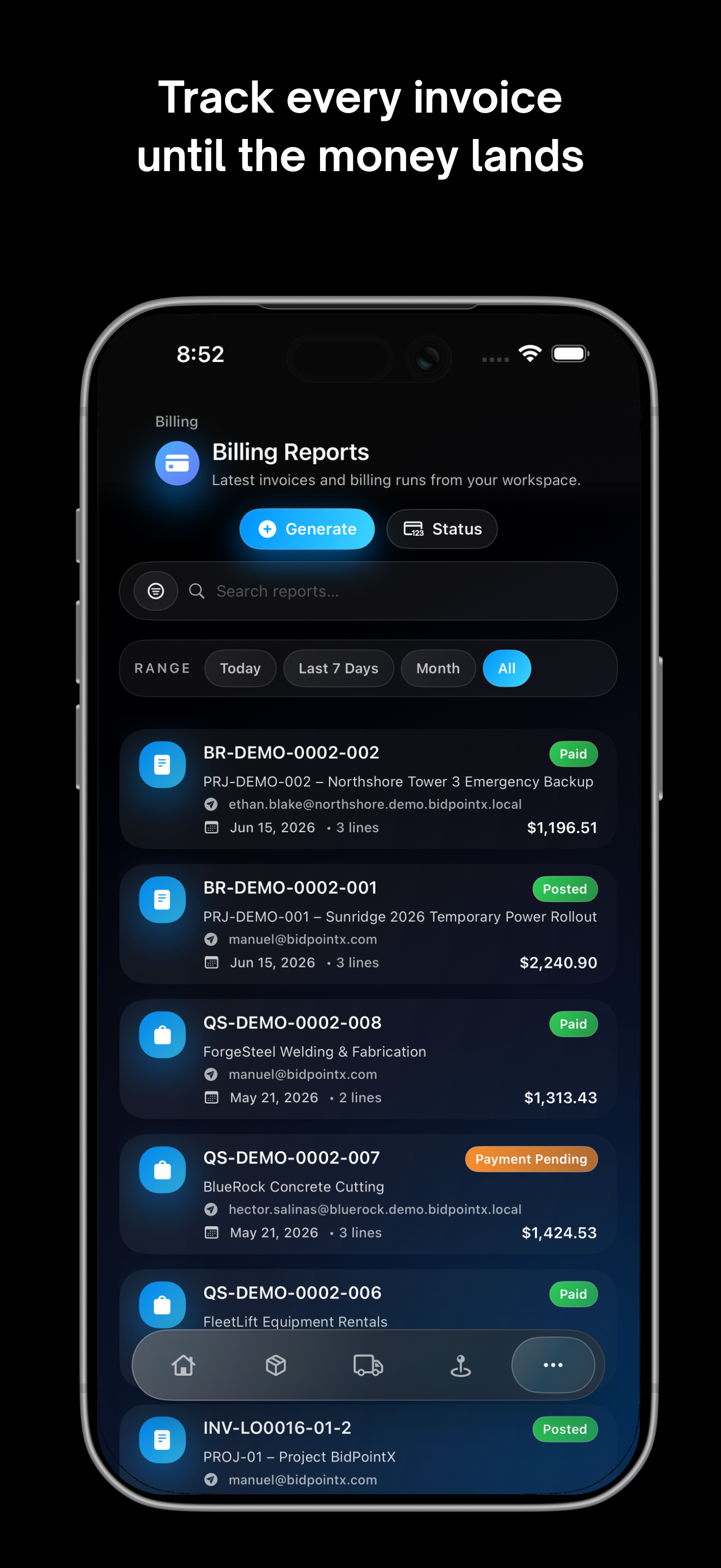
Managing the paperwork associated with these items has been brought firmly into the workflow. Folder and file actions are substantially cleaner, and flows for moving or sharing documents are purpose-built for mobile use. The same philosophy applies to the financial side of the house. Estimates, invoices, billing details, and payout information are highly visible inside the app. This bridges the gap between physical fieldwork and financial follow-through. Users are no longer forced to toggle between separate systems just to see if a job is actually making money.
Ultimately, the best user-centric software is shaped by observing repetition. We watch where users hesitate, backtrack, and perform unnecessary steps to get a simple job done. The product direction for InvenOps is clear. We are building a mobile command center to let you run operations straight from your pocket. Every design iteration we ship is meant to make that promise a reality. Stop tolerating bad software.